Showing posts with label bar. Show all posts
Showing posts with label bar. Show all posts
Monday, February 16, 2015
Fill Colour of bar s based on a condition in Pentaho CDE
This post will talk about conditional colours of bars with below like scenarios.
Sample Scenario :
Print bar color as red when bar value <=2000
Print bar color as green when bar value >2000 and <10000
Print bar color as black when bar value>=10000
Scenario 2 :
When representing -Ve values on charts .. this kind of representation is preferable.
Code is Taken from Reference links :
function changeBars(){
var cccOptions = this.chartDefinition;
// For changing extension points, a little more work is required:
var eps = Dashboards.propertiesArrayToObject(cccOptions.extensionPoints);
// add extension points:
eps.bar_fillStyle = function getColor(){
var val = this.scene.vars.value.value;
if(val > 0 && val <= 5000){
return red;
}
else if(val > 5000 && val <= 50000){
return green;
}
else{
return black;
}
};
// Serialize back eps into cccOptions
cccOptions.extensionPoints = Dashboards.objectToPropertiesArray(eps);
}
NOTE : I have tried directly in Extension points but it did not work.
Sample output 1 :

function changeBars(){
var cccOptions = this.chartDefinition;
// For changing extension points, a little more work is required:
var eps = Dashboards.propertiesArrayToObject(cccOptions.extensionPoints);
// add extension points:
eps.bar_fillStyle = function getColor(){
var val = this.scene.vars.value.value;
if(val == 26297.2900){
return black;
}
else{
return blue;
}
};
// Serialize back eps into cccOptions
cccOptions.extensionPoints = Dashboards.objectToPropertiesArray(eps);
}

References :
http://translate.google.com/translate?&ie=UTF-8&sl=&tl=en&u=http://www.redopenbi.com/group/ctools/forum/topics/colores-en-bar-chart?commentId=2400100%3AComment%3A103280&xg_source=activity&groupId=2400100%3AGroup%3A73260
OR
http://www.redopenbi.com/group/ctools/forum/topics/colores-en-bar-chart?commentId=2400100%3AComment%3A103280&xg_source=activity&groupId=2400100%3AGroup%3A73260
OR
http://forums.pentaho.com/showthread.php?150582-Bar-chart-colors-dynamically-changed-based-on-data-value-Along-with-JavaScript-vars
Sample Scenario :
Print bar color as red when bar value <=2000
Print bar color as green when bar value >2000 and <10000
Print bar color as black when bar value>=10000
Scenario 2 :
When representing -Ve values on charts .. this kind of representation is preferable.
Code is Taken from Reference links :
function changeBars(){
var cccOptions = this.chartDefinition;
// For changing extension points, a little more work is required:
var eps = Dashboards.propertiesArrayToObject(cccOptions.extensionPoints);
// add extension points:
eps.bar_fillStyle = function getColor(){
var val = this.scene.vars.value.value;
if(val > 0 && val <= 5000){
return red;
}
else if(val > 5000 && val <= 50000){
return green;
}
else{
return black;
}
};
// Serialize back eps into cccOptions
cccOptions.extensionPoints = Dashboards.objectToPropertiesArray(eps);
}
NOTE : I have tried directly in Extension points but it did not work.
Sample output 1 :
Sample output 2 :
function changeBars(){
var cccOptions = this.chartDefinition;
// For changing extension points, a little more work is required:
var eps = Dashboards.propertiesArrayToObject(cccOptions.extensionPoints);
// add extension points:
eps.bar_fillStyle = function getColor(){
var val = this.scene.vars.value.value;
if(val == 26297.2900){
return black;
}
else{
return blue;
}
};
// Serialize back eps into cccOptions
cccOptions.extensionPoints = Dashboards.objectToPropertiesArray(eps);
}
References :
http://translate.google.com/translate?&ie=UTF-8&sl=&tl=en&u=http://www.redopenbi.com/group/ctools/forum/topics/colores-en-bar-chart?commentId=2400100%3AComment%3A103280&xg_source=activity&groupId=2400100%3AGroup%3A73260
OR
http://www.redopenbi.com/group/ctools/forum/topics/colores-en-bar-chart?commentId=2400100%3AComment%3A103280&xg_source=activity&groupId=2400100%3AGroup%3A73260
OR
http://forums.pentaho.com/showthread.php?150582-Bar-chart-colors-dynamically-changed-based-on-data-value-Along-with-JavaScript-vars

Thursday, February 12, 2015
Bar chart with Target lines in pentaho CDE making bars as lines using java script in pentaho CDE
Hi guys,
This post teach you how to make bars as lines in pentaho CDE.
Source for this post is : http://jsfiddle.net/duarteleao/7maGD/
and http://type-exit.org/adventures-with-open-source-bi/2011/06/creating-dashboards-with-cde/
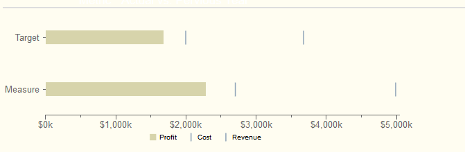
Scenario : Some end users wants visualization of grouped bars as lines where one of the bar is as bar and remaining bars as targeted lines on the same bar.
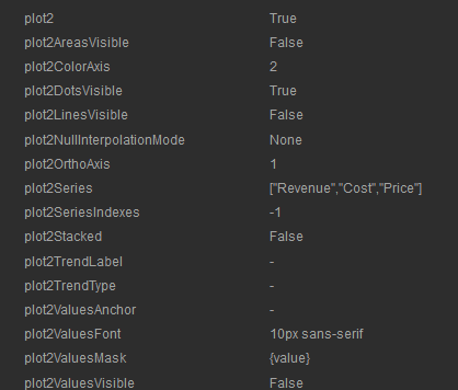
Properties have to give:
Plot2 : True
Find the remaining properties in below image: version of CDE is : 13.06 but will work in higher versions also.
NOTE: Find the image for how to give the above code as properties in Extension points of chart component.
Sample output of the chart on dashboard after giving the above properties.
Sadakar
BI developer
("Learning never exhausts the mind")
This post teach you how to make bars as lines in pentaho CDE.
Source for this post is : http://jsfiddle.net/duarteleao/7maGD/
and http://type-exit.org/adventures-with-open-source-bi/2011/06/creating-dashboards-with-cde/
Scenario : Some end users wants visualization of grouped bars as lines where one of the bar is as bar and remaining bars as targeted lines on the same bar.
Properties have to give:
Plot2 : True
Find the remaining properties in below image: version of CDE is : 13.06 but will work in higher versions also.
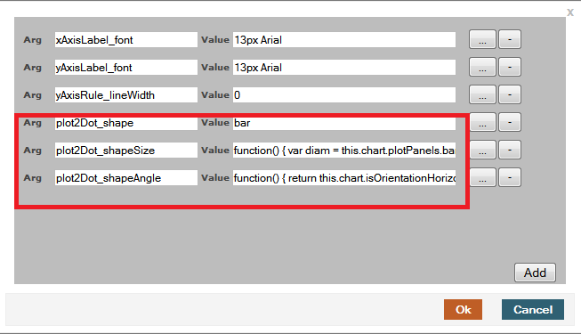
In "Extension points" for the chart component you need to give 3 properties from the first link.
They are
extensionPoints: {
plot2Dot_shape: bar,
plot2Dot_shapeSize: function() {
var diam = this.chart.plotPanels.bar.barWidth ||
this.chart.options.barSizeMax;
return this.finished(diam);
},
plot2Dot_shapeAngle: function() {
return this.chart.isOrientationHorizontal() ? 0 : -Math.PI/2;
}
plot2Dot_shape: bar,
plot2Dot_shapeSize: function() {
var diam = this.chart.plotPanels.bar.barWidth ||
this.chart.options.barSizeMax;
return this.finished(diam);
},
plot2Dot_shapeAngle: function() {
return this.chart.isOrientationHorizontal() ? 0 : -Math.PI/2;
}
NOTE: Find the image for how to give the above code as properties in Extension points of chart component.
Sample output of the chart on dashboard after giving the above properties.
Sadakar
BI developer
("Learning never exhausts the mind")
Tuesday, February 10, 2015
Tip Pie or Bar Chart No visulization when the sql result is having all 0 values in Jasper iReport
Hi Guys,
Recently I came across a situation on plotting the 0 values result set on a pie chart and failed to produce the chart with out leaving any message.
Alternatively I have shown a message saying that "All the values in the result set are zero so can not plot the visualization".
Of course, this is not a big matter to blog but I can say that this is a best practice in report designing and would like narrate for the one who wish to follow best practices.
Your end-client can easily understand when the chart is having all zero values.
Example :
Query : SELECT field1, field2, field3 FROM dummyTable
Output :
field1 field2 field3
---------- --------- ---------
0 0 0
For instance assume you are showing data on pie chart and given expressions in 3 different series lets say "series1", "series2" , "series3".
Now, if you see the preview of the report, you will be getting nothing in output as your query resultset has all values as 0

Drag and drop the "Static Text Field" over the chart from palette section and write your message(message is : All values are zero so can not plot the visualization) and Print this field when ever the values are zero.
For doing this, you have to Write similar like below expression for "Static Text Fields" PrintWhenExpression
($F{field1}==0) && ($F{field2}) && ($F{field3})
Observation or Preview.
Now select some input controls for which you will get result set 0 .. You will get the below similar like output.

Thats it... When ever your query result set is having all 0s you will be displaying message saying that can not plot visualization.
Sadakar
BI developer
Recently I came across a situation on plotting the 0 values result set on a pie chart and failed to produce the chart with out leaving any message.
Alternatively I have shown a message saying that "All the values in the result set are zero so can not plot the visualization".
Of course, this is not a big matter to blog but I can say that this is a best practice in report designing and would like narrate for the one who wish to follow best practices.
Your end-client can easily understand when the chart is having all zero values.
Example :
Query : SELECT field1, field2, field3 FROM dummyTable
Output :
field1 field2 field3
---------- --------- ---------
0 0 0
For instance assume you are showing data on pie chart and given expressions in 3 different series lets say "series1", "series2" , "series3".
Now, if you see the preview of the report, you will be getting nothing in output as your query resultset has all values as 0
Drag and drop the "Static Text Field" over the chart from palette section and write your message(message is : All values are zero so can not plot the visualization) and Print this field when ever the values are zero.
For doing this, you have to Write similar like below expression for "Static Text Fields" PrintWhenExpression
($F{field1}==0) && ($F{field2}) && ($F{field3})
Observation or Preview.
Now select some input controls for which you will get result set 0 .. You will get the below similar like output.
Thats it... When ever your query result set is having all 0s you will be displaying message saying that can not plot visualization.
Sadakar
BI developer
Subscribe to:
Posts (Atom)